If you’ve ever tried to make affiliate sales with a landing page, you know it isn’t as simple as dropping in a product link and calling it a day. The right strategy and a well-optimized landing page make a huge difference in turning clicks into commissions. Landing page optimization can sound intimidating, but really, a handful of best practices can give you a big leg up, no matter the niche you’re in.
Why Landing Page Optimization Matters For Affiliate Marketers
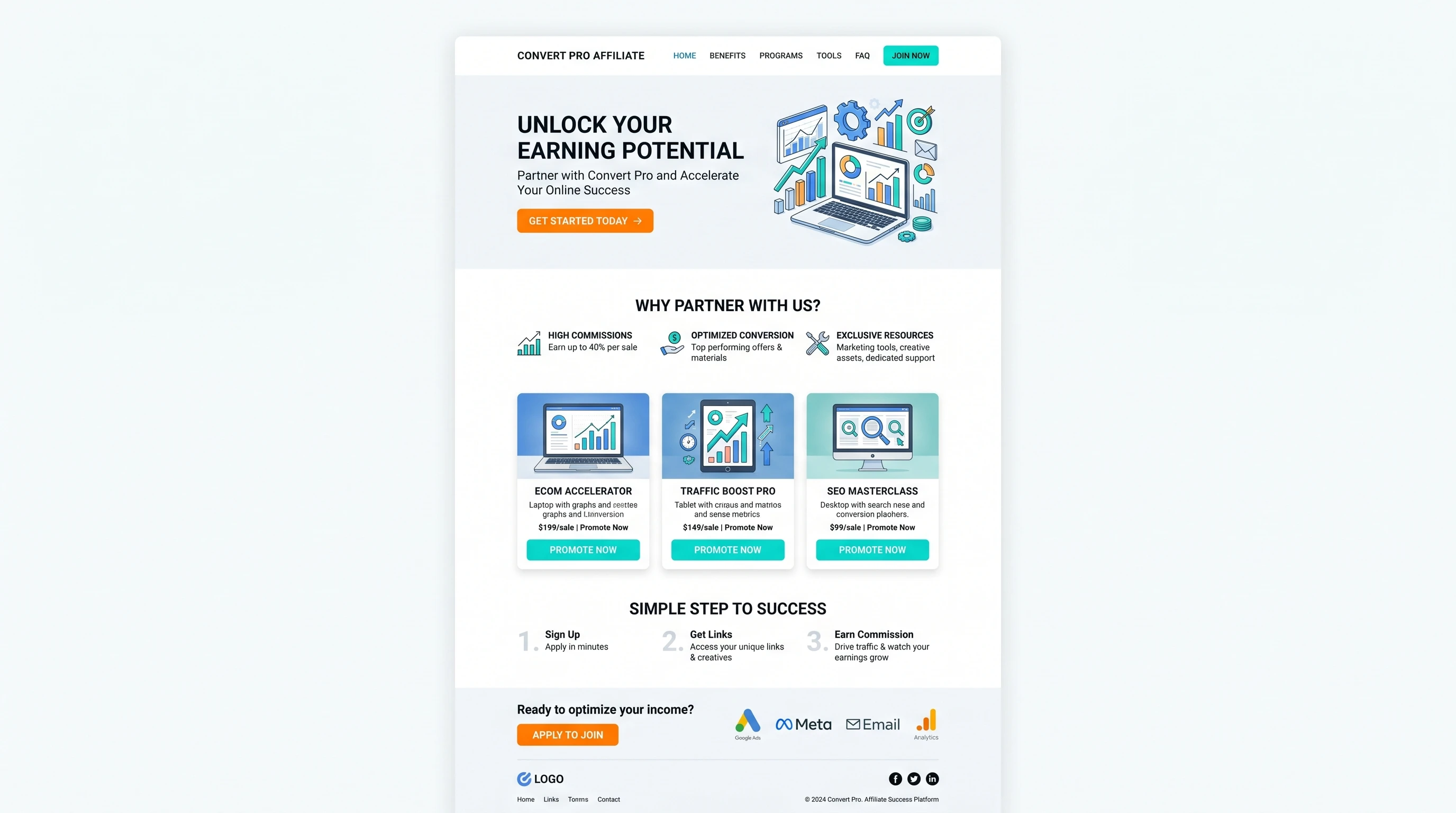
A landing page is your one shot to convince a visitor to click through and buy. That first impression can easily make or break your conversion rates. Well-optimized pages load faster, keep visitors engaged, and funnel attention toward that all-important affiliate link.
Affiliate marketing has changed a lot over the years. When I started, clickable banners plastered everywhere were enough. Now, hundreds of marketers are competing for every sale, and people are wary of anything that smells like a scam. A transparent, useful, and trustworthy landing page gives you an edge. Both Google and human visitors appreciate this clarity and honesty.
Big affiliate programs like Amazon Associates, ShareASale, and CJ Affiliate regularly update their rules and design recommendations. Following optimization best practices not only improves user experience, it can also help make sure you don’t run afoul of your chosen network’s policies.
Key Elements Of An Effective Affiliate Landing Page
There are a few core ingredients that go into a landing page that actually converts. Here’s what’s really important to keep front and center:
- Clear Value Proposition: Visitors need to know what the product does and why it’s worth checking out within seconds. Don’t bury this info under a wall of text; put it big and bold at the top.
- Relevant, Honest Content: Real reviews, demos, or usage tips help build trust. If you haven’t tried the product yourself, you can still research real user feedback and share both pros and cons.
- Obvious Call-To-Action (CTA): The button that leads to your affiliate offer should stand out with a simple phrase like “See The Best Price” or “Try It Now.”
- No Clutter: Keep distractions to a minimum. Each design element should help guide the reader toward your CTA; avoid random pop-ups or endless sidebars.
Putting these pieces together makes it much easier for a visitor to make a decision. I usually test different headlines and CTAs to see what my own audience clicks with best.
Optimizing Landing Page Layout And Design
The look and feel of your landing page have a real impact on conversions. If a page loads slowly or feels overwhelming, it can scare people away fast. Here’s how I set up my layouts to improve performance and keep things sharp:
- Mobile Responsiveness: Most visitors browse on their phones these days. Use larger text, tapfriendly buttons, and simple layouts to make navigation easy on any device.
- Clean Visual Hierarchy: Use size, color, and spacing to highlight important info. The eye should naturally go from headline to benefit to CTA without confusion.
- Fast Load Times: Compress images and use lightweight elements. I always run a quick speed test on tools like Google PageSpeed Insights before publishing.
- Consistent Branding: Matching the color scheme and style of your main website helps people trust your page faster.
Beyond the basics, it’s smart to look at what leading competitors are doing. Many high-converting pages include “sticky” CTAs that follow the reader as they scroll or minimal header areas to keep the focus on your offer. Even small tweaks in layout can set your landing page apart in a crowded field.
Content Strategies For Higher Engagement And Trust
High-quality, transparent content on your affiliate landing page does more than just provide information. It helps visitors feel confident about following your recommendations. Here are the methods I use to give a boost to credibility and get more clicks:
- Use Specific Results: “I saved $40 in my first month” is more convincing than “This product can save you money.” Real-life examples or user testimonials add a personal touch.
- Talk Benefits, Not Just Features: Explain how the product solves a problem. For example, instead of just listing “16GB RAM,” describe how it keeps a laptop running smoothly with multiple apps open.
- Show Proof: Screenshots, comparison charts, or quick demo videos work wonders. If you can, embed your own video or include original photos.
- Be Upfront About Affiliate Relationships: Adding a quick disclosure shows you’re being honest. Most trustworthy programs actually require it.
To truly stand out, consider writing about real-world scenarios or use cases for the product. Address objections or hesitations potential buyers might have, and provide clear answers. The more open and genuine your content, the more trust you can build with your visitors. This step can make a dramatic difference in your conversion rates, especially in markets where skepticism is high.
Common Obstacles In Affiliate Landing Page Optimization
I’ve run into a few classic roadblocks that tend to hold back conversion rates or even get affiliate accounts banned when I’m not careful. Staying sharp for these problems saves a lot of headaches in the long run:
- Overly Aggressive Sales Tactics: Overselling can push people away and hurt your credibility. Stay genuine; it’s fine to mention drawbacks if they exist.
- Unclear Navigation: If a visitor can’t find your CTA or has to hunt for important info, they’ll probably leave.
- Slow Or Buggy Pages: Extra plugins or massive images can make landing pages crawl. Regular check-ins using speed testing tools help spot issues early.
- Ignoring Compliance Rules: Each affiliate network can have different rules about disclosures, claims, and branding. Doublecheck the T&Cs regularly.
Site Speed And Technical Issues
One thing I always keep an eye on is how fast my landing page loads on every device. There’s nothing more frustrating for visitors than getting stuck on a loading spinner. Tiny slowdowns can easily drop conversions. Removing unnecessary code, compressing images, and using caching can keep things running smoothly.
Maintaining Trust And Transparency
Trust is huge in affiliate marketing. Visitors pick up on sneaky tactics and vague promises. I’ve found that being straightforward in both reviews and recommendations helps a lot. Placing my affiliate disclosure near the top and in normal-sized text shows readers I’m open about my business model.
In addition, it’s helpful to include trust badges or security assurances, such as “SSL Secured Checkout” logos if you’re promoting a product checkout page. Clear contact information or a simple FAQ section can also make visitors feel more secure. These small signals add up and can make a big difference in how your landing page is viewed.
Test, Measure, And Tweak For Better Results
Landing page optimization never really ends. Even if you’re happy with your first version, there’s usually room to give a boost to results by testing out different ideas. Here are some practical ways I approach ongoing optimization:
- Split Testing (A/B Testing): Swap out two versions of a headline, image, or CTA button and compare click-through rates. Tools like Google Optimize and Optimizely make this pretty painless to set up.
- Tracking With Analytics: Google Analytics lets you see where people click, where they drop off, and how many end up on the affiliate link. I pay special attention to bounce rates and time on page to spot weak spots.
- Gathering Feedback: Sometimes I pop a quick survey on my site or ask friends to go through the landing page. A fresh set of eyes often catches confusing sections that I missed.
Testing isn’t just for the techy crowd. Even a basic plugin or free tool can show you what’s working and what should be switched up. Some affiliate marketers go as far as running seasonal split tests, taking advantage of holiday traffic spikes to fine-tune their pages for better performance. Experiment regularly to keep your landing pages fresh and competitive.
Picking The Right Tools And Plugins For Affiliate Landing Pages
Whether you’re on WordPress, Squarespace, or another builder, there are plugins and tools that make landing page creation a lot less stressful. Some of the ones I use or see in affiliate marketing circles pretty often include:
- Elementor/Funnels: Drag and drop editors make it simple to build clean, responsive layouts without coding.
- Pretty Links: Tracks clicks from your affiliate links and can tidy up long URLs for a cleaner look.
- OptinMonster: Handy for adding popups or sticky bars (just don’t overdo it and wreck the user experience).
- Google Analytics + Tag Manager: For tracking clicks, conversions, and seeing where people fall off the funnel.
Most of these offer free versions to try out. Finding one or two tools you’re comfortable with saves a ton of time as you build more landing pages. Some marketers also use Canva for quick custom graphics, or Grammarly to polish up copy. The key is consistency—once you find a few tools that fit your workflow, stick with them and keep leveling up your skills.
Frequently Asked Questions
Here are a few common questions I’ve heard from other affiliate marketers just getting started, along with what’s worked for me:
How many links should I include on a landing page?
Sticking to one main CTA and maybe a backup further down keeps things straightforward. Too many options usually just confuses visitors.
What’s the best way to increase trust on my landing page?
Adding real testimonials, actual product usage images, and a clear affiliate disclosure adds credibility right away.
Is video content worth adding to affiliate landing pages?
Yes, quick demo or review videos can increase engagement. Visitors often like seeing proof the product works and knowing there’s a real person behind the recommendation.
Should I focus on a single product or feature several options?
For most affiliate landing pages, highlighting one main offer works best to keep things focused. If you need to compare two products, a simple comparison chart can help without overwhelming the visitor. Just avoid making the choice too complicated, or you might see your conversions drop.
Final Thoughts On Affiliate Landing Page Optimization
Optimizing an affiliate landing page isn’t rocket science, but it does take some testing, patience, and a bit of creativity. Focusing on a clean layout, honest content, and straightforward navigation will boost both your click-through and your commissions. Every small improvement adds up, so keep testing, learning, and adapting as you go. The most successful affiliates are always looking for ways to take their landing pages up a notch and set themselves apart in a crowded marketplace. Stick with these practices, and you’ll see results over time. If you have any questions about what was discussed above I would be happy to discuss in the comments below.