When it comes to affiliate marketing, landing pages can be the difference between a trickle of commissions and a steady flow of conversions. I have spent a fair bit of time testing, tweaking, and stumbling over low-converting landing pages. Turning those underperforming assets into strong sales machines took plenty of learning. So, I’m breaking down the most useful lessons that helped me improve affiliate landing page performance and boost my results.
Understanding Why Landing Pages Struggle
Low-converting landing pages show up a lot in affiliate marketing, for beginners and even for folks with some experience. Sometimes the reasons are super obvious, but sometimes it takes a bit of trial and error to figure out what’s tanking your conversion rates. Before making improvements, I found it really important to pinpoint what wasn’t working.
Landing pages typically run into trouble when they’re either unclear, overwhelming, or just not matching what users want. Common problems include:
- Poor Message Match: Visitors click through expecting one thing but land on a page that talks about something different.
- Slow Load Times: Heavy images, videos, or bad hosting make people bounce before they even read your offer.
- Weak Call to Action (CTA): The button, link, or next step isn’t obvious or feels pushy.
- Cluttered Design: There’s too much going on, too many options or distractions that keep visitors from the action you want them to take.
- Lack of Trust Signals: No testimonials, security badges, or recognizable brands means visitors hesitate before clicking.
I learned the hard way that fixing these basics can move the needle quickly. Even one small fix, like a much clearer headline, often led to a surprising bump in conversions.
Getting to Know Your Audience
Effective affiliate landing pages aren’t just about design and wording. They connect with the visitor. When I dug deeper into who was landing on my pages, I realized my generic approach wasn’t cutting it. Creating buyer personas helped a lot. I started asking:
- What problem does this visitor want to solve?
- Where are they coming from, social media ads, Google search, email?
- What questions or doubts might they have about the offer?
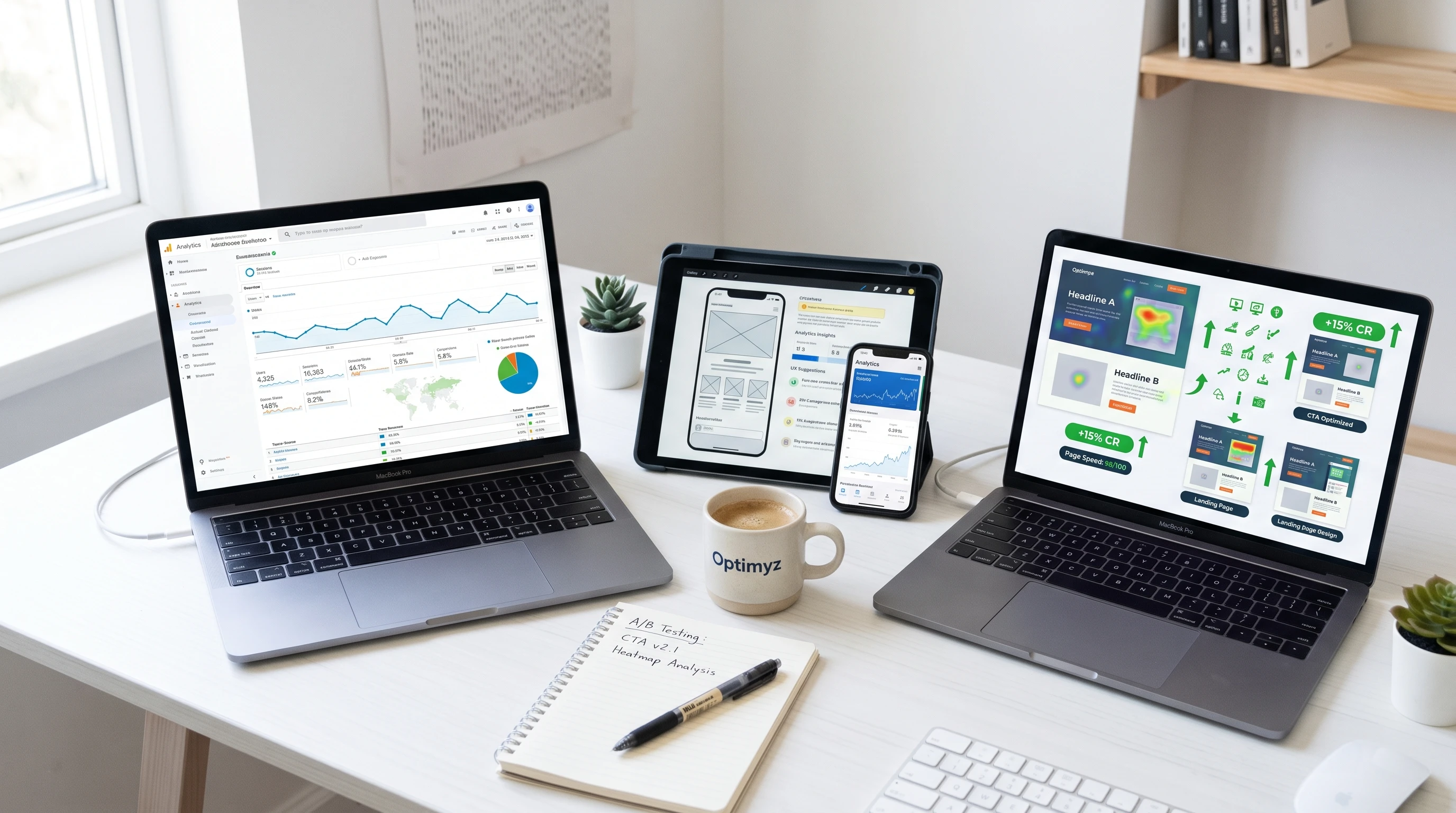
Tailoring content to answer these questions directly led to higher trust and engagement. I also used analytics tools like Google Analytics and Hotjar to see which parts of my page people interacted with most. This helped me cut out fluff and focus on what mattered to real users. Sometimes, I’d run a small survey or poll to get direct feedback, helping me understand not just what visitors were doing, but why.
Digging into audience motivations takes things up a notch. For instance, segmenting by device type or location opened my eyes to differences in how users interacted. Mobile users often wanted quick, upfront answers, while desktop visitors sometimes explored more detailed content. Catering to these expectations gave my conversion rates a real boost.
Simple Steps That Made a Big Difference
Improving landing page conversions doesn’t always mean reinventing the wheel. Sometimes, the best results came from making small, targeted tweaks.
- Sharpen the Headline: I made sure it clearly stated the main benefit so users instantly saw value.
- Streamline the Page: Removing excess navigation links, popups, or unrelated offers reduced distraction and funneled eyes to my main CTA.
- Add Social Proof: Including recent testimonials or reviews, even from my own experiences with the product, worked well. Sometimes, an actual screenshot of the results (with permission) said more than words.
- Highlight the CTA: I made my button color contrast sharply with the rest of the page and used straightforward text, like “Get the Deal” instead of “Learn More.”
- Use Relevant Images: Swapping out generic stock photos for visuals of the actual product or before-and-after shots helped boost credibility.
I’ve messed up plenty of times by trying every “hack” at once. Consistency in these basics proved far more useful in boosting conversions than overcomplicating things.
Things to Watch Before Making Changes
Jumping in and changing everything can backfire. Here’s what helped me avoid spinning my wheels:
- Check Your Traffic Source: Not all traffic behaves the same. Paid clickers from Facebook act differently than people coming from organic search.
- A/B Test, But Only One Thing at a Time: If I changed the headline, I left everything else alone to see the true effect.
- Track the Right Metrics: Don’t just watch conversions. Time-on-page, bounce rate, and heatmaps helped me spot where people lost interest.
- Mobile Friendly First: More than half my traffic was from phones, so I always checked design and speed on mobile before desktop.
- Be Patient: Sometimes it took a week of steady data to see real trends.
Understanding Traffic Source Nuances
Landing pages get visitors from tons of places, like search ads, email, social, and display networks. I quickly learned that copying the exact same approach for each traffic source didn’t work. Email traffic tended to convert better with longer, story-driven pages. Paid ads needed short, punchy messages and immediate trust signals. Mapping landing page styles to traffic source gave me faster improvements compared to generic one size fits all tactics. For instance, when running retargeting campaigns, repeating the offer too aggressively could turn off repeat visitors, so soft reminders worked better than bold asks.
Choosing What to Test
It’s tempting to overhaul colors, wording, and layout all at once. That makes it impossible to figure out which tweak actually helped. I started by testing headlines, then moved to CTAs, and then body content. Each change got at least a couple hundred visits before I called it a win or moved on. Tools like Google Optimize and Optimizely are pretty handy if you want something plug and play. Keep a simple spreadsheet log of what you test and your observations. Over time, you’ll have a record of which ideas worked and which didn’t.
Advanced Strategies That Lifted My Conversions
For me, getting past the basics led to experimenting with some more nuanced strategies. These upgrades took more effort, but they paid off as my affiliate business grew. If you’re ready to step things up, here are a few ideas I’ve used:
Personalization: Showing a visitor’s name or referencing why they landed on the page (like a special offer mentioned in an email) made offers feel more relevant and genuine.
Countdown Timers & Scarcity: Adding a real countdown or showing stock limits worked when it was true, but only when aligned with an actual deal or launch. Fake urgency actually hurt trust, so honesty is super important here.
Exit Intent Offers: When users were about to leave, a popup offering a tiny bonus or a second look at the deal caught a portion of the “almost lost” traffic. I kept these minimal and relevant, with no guilt trips or overload.
In Depth Comparisons: For review or product selection landing pages, I found tables and side by side feature breakdowns kept visitors engaged and answered doubts that might’ve sent them to a competitor’s site.
Layered Proof: I started combining written testimonials, video experiences, data snapshots, and badges for a more well rounded trust boost. Don’t underestimate the value of a short, casual customer video over high-gloss professional promos. Authenticity connects.
Useful Tools and Resources
Using the right tools cut down the guesswork and made optimizing a lot simpler. Here are some resources I found super useful:
- Google Analytics: Just basic analytics gave deep insight into what’s really happening on the page.
- PageSpeed Insights: This found problems that slowed my landing pages down, often a silent conversion killer.
- Canva or Figma: For quick, attractive visuals that didn’t look like every other stockladen affiliate page.
- ConvertKit and Mailchimp: Great for setting up landing pages if you want to capture email leads before recommending an affiliate offer.
I also made use of tools like Crazy Egg for click heatmaps, and even surveyed visitors with a polite exit survey. Sometimes just a handful of responses can shed light on what’s working or needs improving.
Real-World Affiliate Scenarios
Seeing patterns in different niches made me a lot smarter about what works for various types of affiliate pages. Here are a few examples I’ve handled:
- Fitness Product Landing Page: Direct results photos, user reviews, and fast tracked bullet points led to better conversions than long, wordy copy.
- Software/Tech Affiliate Page: Simple, step by step comparisons, believable demo videos, and trust logos were winners.
- Online Course Landing Page: Video testimonials, a clear module list, and limited time discount codes had a visible impact.
The key across all these: address hesitations, keep things honest, and guide the visitor right to the core offer without fluff. In each scenario, real transparency beats hype every time.
One thing that often sets top landers apart is focusing on a single big promise per page. You might highlight the hottest fitness result, the most compelling tech feature, or the one key skill learners get from a course. Don’t overload by mixing lots of different offers or bonuses. Let the visitor focus.
Frequently Asked Questions
Q: How long should I let a landing page run before making changes?
A: I usually give a new page at least one week and aim for at least 200-300 visits before tweaking. More data means clearer results.
Q: Is it worth building separate landing pages for each affiliate offer?
A: Yes; tailoring each page to the specific promise and audience of the offer improves trust and conversion rates.
Q: Can I use free website builders for affiliate pages?
A: For getting started, free builders are fine as long as they don’t bog down performance or lock features behind paywalls. Just double-check page load speeds since free platforms can be a bit slow.
Q: How do I know if my landing page matches the audience’s expectations?
A: I always check by pairing ad copy or email messaging directly with landing page headlines. Watching bounce rate and scroll depth helps spot disconnects.
Wrapping Up
Improving low-converting affiliate landing pages definitely isn’t a one-and-done job. Staying curious and keeping up with new tools and strategies has helped me keep conversions moving in the right direction. Even small changes based on the real world lessons above can mean a big leap in commissions over time. Every page is a chance to connect better and make each click count. If you keep listening to your audience and adapting, those hard learning experiences will turn into steady wins and real income growth over time.