
Getting people to actually click on your links can make a real difference if you want more engagement, leads, or sales from your website. Where you put your links is a detail that’s easy to overlook, but from my experience, it can affect click-through rates more than you might expect. In this article, I’ll go over practical strategies and proven insights to help you figure out the most effective link placements for higher click-through rates, whether you’re running a blog, landing page, or ecommerce store.
Why Link Placement Really Matters
When I look at how users interact with websites, I’ve noticed that many people scan for useful content and rarely read every word. This means that links hidden too deep in the page or buried in footers get missed. According to a 2023 Nielsen Norman Group study, links closer to the top of the page and those surrounded by relevant content are clicked far more often compared to those at the end or stuffed into sidebars. Source: Nielsen Norman Group
Click-through rate, often shortened to CTR, tells you how many users actually clicked on your link compared to how many saw it. Placing links in spots that match how people interact with a webpage has proven to boost these numbers, leading to more traffic and, sometimes, better conversions.
For anyone running a business, blog, or marketing campaign, improving CTR is directly linked to achieving your overall goals, whether that’s more ad revenue, product sales, or sign-ups for your newsletter.
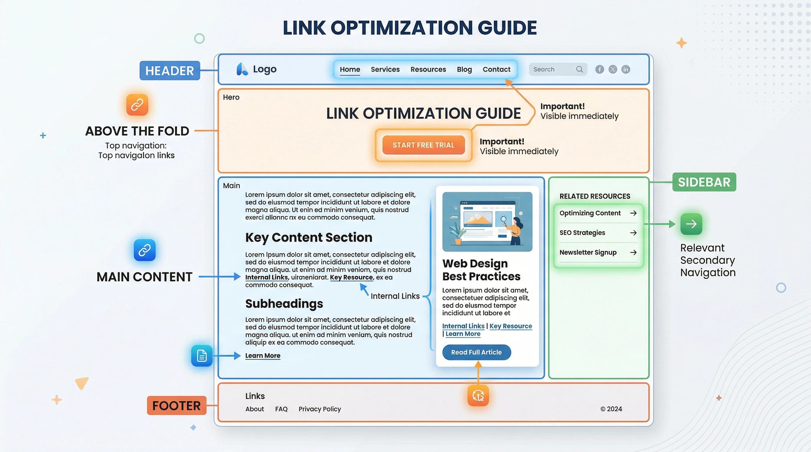
The Basics of Good Link Placement
Knowing the fundamentals of link placement helps you get the most out of every link on your site. Here are a few key points I always keep in mind when deciding where to put links:
- Above the Fold: Placing important links near the top of the page (what users see before scrolling) generally boosts visibility and clicks. People’s attention drops quickly as they scroll, so make the prime spots count.
- Incontent Links: Links found inside paragraphs and main content catch readers while they’re already engaged. These perform better than sidebar or footer links.
- Relevant Surroundings: A link makes more sense and attracts more clicks if it’s surrounded by text or images that relate directly to what the link offers.
As an example, whenever I include a product recommendation within a paragraph explaining its use, I see higher clicks compared to simply listing the link separately. People want context before committing to a click.
How to Strategically Place Links for Maximum Impact
There’s no one-size-fits-all approach, but here’s what I’ve found works for a variety of websites and content types:
- Contextual Anchors: I use links on specific keywords or phrases that make sense naturally in the sentence. Generic phrases like “click here” can cause users to ignore the link or miss its purpose.
- Early Placement: Including a relevant link within the first two paragraphs delivers better results, especially for calls-to-action such as newsletter sign-ups or product demos.
- Visual Breaks: Breaking up long sections of text with natural links helps maintain user attention and increases clicks. Too many links too close together can backfire, so I always space them out thoughtfully.
- Buttons & Visual CallstoAction: Buttonstyle links tend to get more clicks when placed directly after a clear offer or value statement. I keep button color and size consistent with my site design so it stands out but doesn’t feel jarring.
- Sticky or Floating Bars: Keeping a signup or promo offer visible as users scroll can work for important CTAs, though I make sure it doesn’t cover up valuable content or annoy users.
If you’re creating a page, try to keep an eye on the balance between your links and content. It’s not just about quantity; each link should serve a real purpose and naturally fit with the flow of the text. I also recommend occasionally reviewing your site through the eyes of a new visitor. Is the path you want them to take clear? Adjust your strategy as needed and test new placements to see what works.
Common Link Placement Mistakes (And How to Fix Them)
Over the years, I’ve tried plenty of different link placements, sometimes with disappointing results. Here are a few common mistakes and some ways I’ve learned to avoid them:
- Cluttering With Too Many Links: Packing every paragraph with hyperlinks can overwhelm readers. I now focus on quality over quantity—one wellplaced, relevant link beats a handful of random ones.
- Neglecting Mobile Experience: I always check how my links look on smaller screens. Sometimes links that work great on desktop become hard to tap on mobile. Making sure buttons are spaced and links are large enough helps readers click easily from their phones.
- Using Confusing Anchor Text: If a link doesn’t make sense or feels out of place, people won’t trust it. I choose anchor text that clearly tells the reader what to expect after clicking.
- Ignoring Analytics: Not all pages act the same. Reviewing Google Analytics or another tracking tool helps me see where links get the most clicks, which lets me improve placement on weaker pages.
The Psychology Behind Link Clicks
I’ve noticed that small tweaks in wording, color, or adjacent content can impact link performance. Here’s why:
- Visual Hierarchy: Bold or colored links that contrast with body text catch the eye. I avoid making everything bright and flashy, since users learn to tune those things out if overused.
- Social Proof: Links paired with quotes, testimonials, or user ratings get more attention. For example, adding “See how 2,000 people improved their workflow” next to a demo link moves people to click.
- Urgency and Scarcity: A time-limited offer or an “only a few left” message right near a link can gently nudge users to act sooner, boosting CTR without feeling pushy.
Colors, placement, and language all work together to make a link feel like an opportunity instead of just another part of the page. If you combine visual cues with honest value, people are more likely to click through and interact with your offer or recommended resource.
The Impact of Site Structure and User Flow
It’s easy to think just popping a link into your content does the job, but the layout of your whole site plays a role. If your mostclicked actions are buried deep in menus, user flow suffers and so does your click-through rate.
Mapping out a simple, logical path from landing to action helps users understand where to click next. Using breadcrumbs, simple navigation, and clearly marked links at the end of each section keeps people moving, rather than leaving your site frustrated.
I also find that reviewing heatmaps and user recording tools can provide an inside look at how real visitors interact with your page. Watching where users stop, click, and hesitate helps you identify which sections could use more prominent or clearer links.
Examples of Effective Link Placement
- Blog Posts: Adding a relevant article link (like “Read next: Advanced Link Placement Strategies”) within the main text where user interest peaks gives people a next step to follow.
- Product Pages: Including feature comparison links above pricing or next to customer reviews helps answer questions before purchase, leading to higher CTR and better conversions.
- Landing Pages: Placing the primary CTA above the fold, repeating it after a benefits section, and finishing with another link or button at the very end covers users with different reading styles.
- Newsletter Signups: After identifying a need or problem in the intro, I find that including a signup link there works well, while a second link right before the conclusion catches late deciders.
An extra tip: consider adding exit-intent popups with carefully selected links when users are about to leave your page. Used sparingly, these can catch attention and squeeze a few more clicks, but always test their effect on bounce rates and user satisfaction.
Things to Consider Before You Change Your Link Placement
There are a few extra factors to keep in mind. Here are the main ones I watch out for when updating link placements on my sites:
- Website Speed: Loading times matter. If your links are in popups or dynamic bars that slow down the site, users might bounce before seeing anything.
- Accessibility: All links should be easy to spot for users with visual or physical impairments. Underlined or colored anchors and keyboard navigation make a real difference.
- Consistent Tracking: UTM codes and other tracking methods give you a fuller picture of what’s working, especially if you test different link locations.
Website Speed
Heavy scripts or lots of animated banners can reduce site speed and push links out of view. I periodically run my pages through speed tests and tweak anything that might be hurting performance, especially for pages with high CTR goals.
Accessibility
Clear and easy-to-understand links help everyone, including users who depend on screen readers. I make sure links are descriptive, have high contrast, and stand out from body text. Testing with accessibility tools is a smart habit for anyone.
Consistent Tracking
Using UTM parameters or event tracking on key links tells you which placements really deliver. I regularly check analytics for dropoff points and move links if I see spots where users are stalling.
Frequently Asked Questions
Question: How many links should I include on a single page for the best clickthrough rates?
Answer: While there’s no fixed number, I find that two to three wellspaced, highly relevant links within main content tend to perform better than loading every paragraph with a hyperlink.
Question: Should I use the same link multiple times on one page?
Answer: Yes, but only if it makes sense contextually. For example, I might include a key CTA link at the top and bottom of a blog post to catch both early and late readers.
Question: How do I know which link placements perform best?
Answer: Tracking clicks using Google Analytics or a similar tool helps you spot which link locations get the most engagement. I run regular checks and AB tests to improve results.
Key Takeaways for Boosting Click-Through with Smart Link Placement
Making small improvements in how you place your links can really lift your click through rates. It comes down to matching your links with user attention, building trust with clear anchor text, and always reviewing click data to see what’s working. After making sure the basics are covered, I keep experimenting with new placements and always test on mobile for the best results. A few tweaks can be the difference between links that go unnoticed and links that actually get the clicks you want. If you have any questions about what was discussed above I would be happy to discuss in the comments below.